Sunday, January 23, 2011

Answers, Kollwitz, Spiekermann

When I went to the library today, Die neue Typographie was absent from the shelf. I hope it reappears. In any case, I will attempt to answer some questions my professor posed to my post from a couple of days ago, though without any Tschichold quotations to back me up.

1. Tschichold wrote an entire section about photography, but I'm at a loss as to specifics of his argument. But, I think a good response to your question is the general view that photography is objective (which it isn't) compared to say, expressionist painting. Jan has a problem with accompanying a Modern medium like photography with Schnörkel, etc. And, I think that as a man of the Neue Sachlichkeit, he not only has faith in technological wonders, but views them as superior and more beautiful than human creation. As he wrote, order=beauty.

2. To answer the question of "Beamtenschrift," going back to the woodcut commissioned by Maximilian I is useful. You're right! Fraktur in its original form had everything to do with pictures. It was created to accompany images that the public/visitors/admirers/whoever could appreciate, while historians were probably the only ones the Kaiser expected to read the actual text. Tschichold seems to reject Fraktur precisely because of its inaccessibility, both aesthetically and historically. He believed that basic functionality was the first priority of any typeface. In that sense, Fraktur could be connected with elitism, old structures of social order, despotism, etc. Ironically, several designers interviewed in the documentary Helvetica equated the ultimate modernist sans serif, Helvetica, with war, consumerism, uniformity, oppression, etc. Functionality, by the late 20th century, came full circle to become a typographic oppressor instead of liberator. At least that's what some post-modernists said. Don't quote me on this.

3. Tschichold thought EVERYTHING should be in Grotesk. Everything.

And, finally, I think the answer to the Grotesk vs. Law question, the only answer, from the Tschichold perspective, is that words themselves are not objective, but rather their graphic representation should be (hence the sans serifs). So, I think that posing Grotesk and Law against each other is invalid because one is a typeface and the other is something the typeface represents. Feel free to shoot me down on this one.

On to my ever-exciting activities of the day:

I went to the library to see if the Berliner illustrierte Zeitung ever switched out of Fraktur during the Weimar Republic. It didn't. While I was looking, I came across an interesting tidbit that goes back to my original topic: representations of the New Woman. In an October issue of the BIZ, 1927, the cover featured an image of a woman and a man, dressed and styled almost identically with fitted sport coats, ties, slick hair, and cigarettes, walking together with figures in the background looking on and evidently making snide remarks about the woman's androgynous appearance. Inside the front cover, the Zeitung posed a question with a competition for who could come up with the wittiest answer. It was similar to the New Yorker caption contest, but mean. Here is what it said:

"Das Bild auf der Titelseite zeigt eine Zeitgestalt "Fräulein Mia," einen neuen Mädchentyp, der sich in Arbeit, Lebensführung, und Erscheinung den Mann zum Vorbild genommen hat...Was sagen Sie bloß zu Fräulein Mia? 3.000 M für die witzigsten Lösungen."

Hilarious. (Not.) Coming into this topic, I was sort of expecting to have to interpret a lot of complex imagery with many meanings reflecting different views of women, but this is pretty blatant and straightforward. It will be interesting to compare this view with images from Die Dame in 1927 and 28.

I went to the Käthe Kollwitz museum in the afternoon. I have to say, of all the art I've seen so far, hers is easily the most beautiful, in my opinion. Even her political posters feature handwritten script, which is refreshing after thinking really hard about Modernist typeface lately.

I also started reading a book by a designer named Erik Spiekermann called Ursache & Wirkung: ein typographische Roman. To be honest, I don't really understand it. But, his basic thing is that modernists are bad because they make everything uniform, which is not the way things are. He is also just awesome, as demonstrated in this news clip.

Even though I find Spiekermann fascinating, his super precise and technical discussion of typeface in his book sort of made me realize that I am completely unequipped to actually study typography, mostly because of my lack of background in graphic design. So, I think I might change gears a bit and try to ground my investigations in history a bit more. We'll see how that goes.

Anyway, I guess the only Richtung to head at this point is forward, which I will do by looking more at Die Dame, maybe checking out the DDR museum (the Buchstabenmuseum has gotten me super interested in relics/material implications of the fall of the DDR), and attempting to get access to the poster archive of the Deutsches Historisches Museum. That would be truly epic, as kids these days would say. In any case, stay tuned.

Saturday, January 22, 2011

Schrift in Berlin, pt. 1: Alexanderplatz

I went to the Bauhaus Archive museum today. It was very cool. I saw some more drawings, models and things by all the famous Bauhaus greats: Mies van der Rohe, Gropius, etc. I liked (of course) one quotation of Herbert Bayer the exhibit had up on the wall: "wir schreiben alles klein, denn wir sparen damit zeit." Bayer wanted to reject was he perceived as German over-use of capitals. Turns out a typeface has been developed based on his drawings: http://en.wikipedia.org/wiki/File:ABayer.png

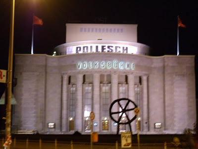
When I emerged from the U Bahn at Alex afterward, I decided to start a bit of a photo project to go along with my wanderings. There isn't much point, except to take pictures of Schrift in Berlin because I like it. Unfortunately, the photography is not good thanks to my low-level camera and perpetually bad light in Berlin. Alas, life goes on. So, for today, here is Schrift in Berlin, pt. 1: Alexanderplatz.


Tomorrow I will go back to the library (for real this time), then probably check out the Käthe Kollwitz museum. I might even take a break from talking about type/lettering. Maybe.

Friday, January 21, 2011

Neue Nationalgalerie, Tschichold, and Plans

Today I went to the Neue Nationalgalerie to see its exhibit, Moderne Zeiten. The exhibit had a range of works from early expressionist up through the Neue Sachlichkeit, Socialist Realism, etc. It wasn't a huge collection, but I got to see some SUPER famous works of the period. Most exciting/awesome were:


Otto Dix's "Mondweib" and "Die Skatspieler," 1919 and 1920

Works by Bauhaus artists/designers Feininger, Klee, and Moholy-Nagy

And, some cool stuff by Oskar Nerlinger, including "Berlin City Train"

There was also a painting by Friedrich Vordemberge-Gildewart that was essentially several straight squares with an actual straight-edge/right angle tool (whatever you call those things) nailed onto the piece.

Anyway, I went back to the library this afternoon to investigate typography some more, looking especially for the Modernists' take on the old Fraktur style/its use in popular media. Zing! Jan Tschichold had something to say. Note that Fraktur looks like this:
Grotesk is the German word for sans serif, z.B. Verdana or Helvetica (though both were developed later). Tschichold ususally refers to serif fonts as Antiqua because they come from ancient Greek and Roman alphabets. Anyway, this quote on die illustrierte Zeitungen of the 20s is from Tschichold, Die neue Typographie, 1927:

"Für die Notwendigkeit der Grotesk als Auszeichnungsschrift kann man noch den weiteren Grund anführen, daß sie die einzige Schrift ist, die der Photographie wirklich entspricht, und zwar durch die beiden gemeinsame innere Objektivität. Die Schnörkel und Ranken der Fraktur, dieser Beamtenschrift des 16. Jahrhunderts, gehören nich mehr in unsere Zeit und werden nie zu einer solchen ausgeprochen gegenwärtigen Druckform wie der illustrierten Zeitschrift passen."

Ho Ho! I think it's time to go back to the Zeitschriften (Die Dame, but also non-gender-specific illustrated newspapers of the time) to check out who is and is not in line with Jan. Also: Fraktur brings to mind propaganda posters from the 3rd Reich. It might be interesting to investigate typeface as associated with political propaganda. Were parties that called for traditional "German" values more likely to employ Fraktur? Probably.

P.S. I tried to put the Tschichold quote in Verdana so as not to offend him with my serifs, but the internet-device isn't cooperating. Also, Schnörkel is my new Lieblingswort auf Deutsch.

Thursday, January 20, 2011

Notes on Typography und das Buchstabenmuseum

This morning when I set back into the issues of Die Dame of 1920-21, I had trouble going through them quickly. Though the top reasons included the interesting pictures, the funny ads, etc. one of the most striking differences between this Zeitschrift and its modern (and I mean modern as in present-day) counterparts is its typeface. Die Dame, as of 1920, still used old German typography, i.e. Fraktur, Gothic-style blackletter.

This typeface stands out because my main fascination with Weimar visual culture is the phenomenon of Modernism. Before I came to Germany I went through a series of discoveries on typeface, including the film Helvetica about the modernist sans-serif developed in the 1950s and Jan Tschichold's 1928 declaration of modernist typographic standards, Die neue Typographie. Finding it in the original German is #1 on my to-do list for tomorrow. So, I came into this adventure with the partial purpose of observing typefaces and how they correspond to the content, message, and general aesthetic purpose of the text in question. In the case of Die Dame in the early Weimar period, I would tentatively state that the Fraktur typeface (which I will discuss more in a moment) corresponds with still relatively old-fashioned styles and content geared toward women. By this I mean that androgynous fashions, bobbed haircuts, and cigarette ads were not yet prevalent in the magazine. Whether or not typeface changes correspond with fashion changes I still don't know. But, it is safe to say that as of 1920-21 the modernist movement in graphic design was not yet in full swing and had not reached one of the major women's fashion magazines.

Anyway, after lunch I decided to stretch my legs, ditch the library, and go check out the Buchstabenmuseum. Best idea ever. This place is awesome. A postcard is in the mail on the way to you lucky ones in the Colbs German department, and I'll go back to take pictures to post very soon. The Buchstabenmuseum is a tiny exhibit in a space in a weird mall across from Alexanderplatz. The American intern working there called the building "DDR-tastic." I think it's being torn down pretty soon. The museum itself is basically a bunch of torn-down letters from various institutions and businesses that sit jumbled around in the little space. Huge letters with neon lightbulbs are just lying around, leaning against walls and stacked on each other. It sort of looks like a letter junkyard.

The best ones are the DDR relics. Most notably are the letters RUNDFUNK from the old DDR radio station and the H-A-U-P from the old DDR Hauptbahnhof. When the wall fell, they changed the name to Ostbahnhof, replacing only the HAUP. You can go to the Buchstabenmuseum to see the old letters. So cool. And, the intern also told me that the head of the museum was the main adviser to the makers of Helvetica for the part of the film in Germany. Even cooler.

We're not done yet. Alex, the intern, pointed me to the Kulturforum, where there is currently an exhibit called "Schrift als Bild" about medieval and early modern typography. There were some cool old choir books and bibles with ornamental scripts. But, the best part was the woodcuts from the 16th century. Albrecht Dürer and his helpers created during the reign of Kaiser Maximilian I some humongous woodcuts that were on display. Most notably, a woodcut titled Triumphwagen für Kaiser Maximilian I, 1522. The woodcut features a large caption created by typesetters Hieronymus Andreae and Johann Neudörffer. The description of the piece mentions the typeface and concludes: "Bald etablierte sie sich als typisch "deutsche Schrift" in der Typographiegeschichte." !!!! That was the original typeset that would become the standart Fraktur used in almost all German publications up until the 20th century.

So, my original pondering on the typeface in Die Dame led me from one place to another, to the Buchstabenmuseum, and eventually to the original piece that ever used that very typeface. I love Berlin.


Wednesday, January 19, 2011

Progress!


I gained access to Die Dame today! After a bit of discussion with several employees of the Humboldt Uni Bibliothek, I attained a visitor card and entry into the Forschungslesesaal. Success. There were all the issues of Die Dame I could ever ask for. Hopefully they prove as useful and interesting as I imagined.

I also met up with good old Dave Oxnard today and acquired a Handy, which is good. A picture for Herr Dr. Shahan is mandatory at this point:

Needless to say, I will be paying a visit very soon. Another discovery: Buchstabenmuseum!!!! Stay tuned for a detailed description of that as well as the Käthe Kollwitz museum, which I am looking forward to greatly. Until then, on to the HU Bibliothek!

Monday, January 17, 2011

First Day


I've arrived! I'm still in a jet-lagged haze bordering on losing all brain function, but Berlin is awesome. I haven't done much but wander around Mitte, so I'll show what I've got: the view from a bridge a few blocks down from where I'll be living. Stay tuned!

(Museumsinsel mit dem Fernsehturm im Hintergrund)

Sunday, January 16, 2011

Departure Day!

Today's the day!

I'm flying out of Newark this evening, and I'm ready to go. Even though this blog is mostly for my academic work, there will be pictures!

Besides reading up on various secondary work relating to women in the Weimar Republic, I've been investigating various must-do things in Berlin to check out. For anyone that has been, please give addition/subtraction suggestions!

  1. All major museums, including modern art, national museum, etc.
  2. Bauhaus-archiv museum
  3. Woyzeck!! (This one's for you GM297) Plus, it has music by Tom Waits!
  4. East side gallery (again)
  5. Berghain? I'll at least look at the outside...
  6. Kunsthaus Tacheles. I don't know too much about this gallery, but it's on my block and looks cool.
  7. Deutsche Kinemathek- Museum for Film and Television- self explanatory.
  8. etc...give me your ideas!
Wish me luck on my journey!